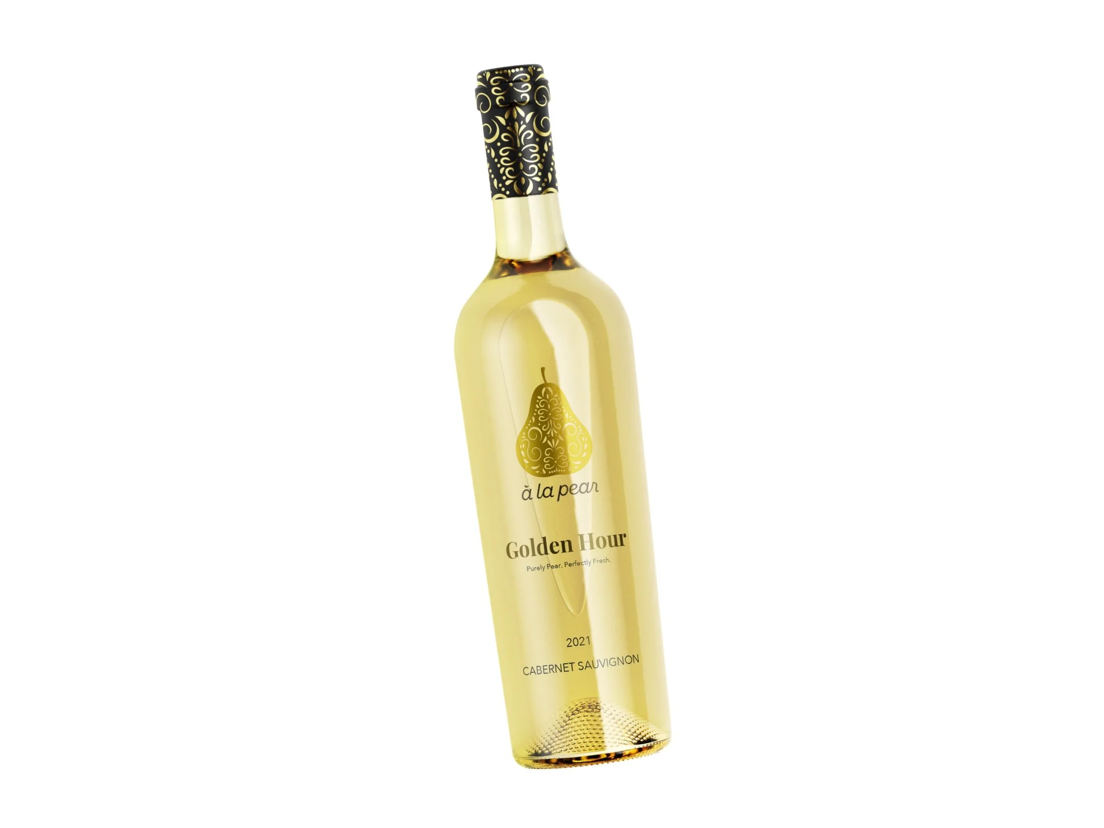
à la pear | a little chaotic. a lot of taste.
Challenge
Creating a cohesive system for three very different product types — wine, spreads, and preserves — while keeping the brand’s tone flirty, literary, and intentionally chaotic. The identity needed to scale across packaging, web, and social without losing personality.
Solution
An intricate pear mark paired with elegant typography, layered storytelling, and cheeky copy. Color palette and visuals reflect a balance of soft jazz and golden hour, while packaging and digital design push narrative-driven interactions that invite users into the plot.